Dual Pixel Blog
Color Schemes - A Look Into How Big Brands Use Color
Mckenzie Holder • June 17, 2020
Color is associated with mood. Color combinations can evoke specific emotions in customers. Are you looking for a cool feeling or a natural bright feeling? It all depends on which colors you use and how you use them. Here are a few things to keep in mind when deciding on what color scheme is best for your purpose.
Tone
Picking the right tone conveys what type of emotion your design evokes. Tone is different from contrast or color. Tone is how bright or dark you want the colors to be.
Let’s talk about red and pink. Both colors originate in the same hue but often evoke different feelings. Red is mature and strong, eliciting love and anger; while pink can feel immature and childish, candy and barbie.
Red is a bold color. It can be used to draw attention and can often be used as a statement color. Brands such as Coca Cola© and KitKat© have been using red as their staple to draw attention to their brand.
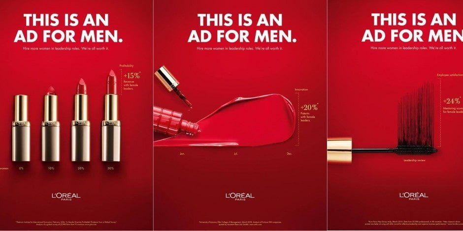
Loreal Paris© decided to use red in a way that drew attention and provided confidence. They created a dark and challenging red.
Green is often a color associated with natural bright feelings or it can be used to show the feeling of disgust or nausea. Depending on how you use green, it can convey what emotion you wish to project, and influence your customer’s willingness to purchase your products or services.

Sprite© has been using green to express the feeling of drinking their soda. It is crisp, refreshing, and light. It is a pleasant beverage to drink on a hot summer day.

Mountain Dew, on the other hand has been using green as an energizing color. A color that makes you want to get up and move.
Influence of Other Colors
When you’ve decided on which color best suits your product or services, it is important to consider the impact of complementary colors. Coca Cola has always used Red and White as their scheme. The white brightens up the red giving an overall friendly tone. Brands like Target, Heins, and H&M have followed suit. White can also tone down the red depending on whether you use it for the background or the focal point.
Netflix is a great example of showing the difference in complimentary colors. Each different combination of colors has changed the feel of the overall brand.
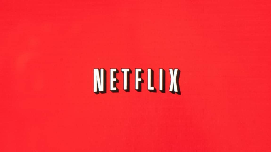
Their first color combination gave it a sort of movie theater feeling. Watch the movies from the comfort of your own home. They are bringing the theater to you.

Their next logo was modernized. The bright colors are still used but the feeling has been taken down a few notches. It is a family service after all. The white tones down the red giving it a less intense feel.
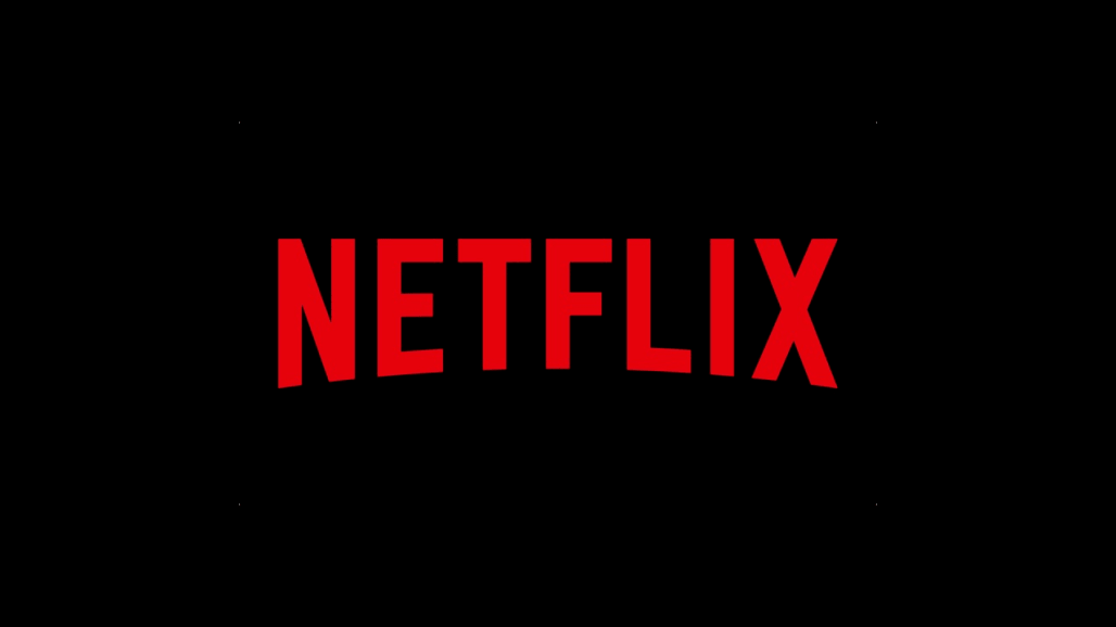
Their current logo has replaced the white with black giving the entire brand a more mature attitude. After all, they have gone from simple movie renting to creating several of their own successful series.
Contact Us
Looking for a way to spice things up? Changing your branding colors, icons or typography can really brighten up your design and give you a great new look. Whether you’re looking for sophistication or urban chic, a great re-branding effor can be a great way to display your company's unique style. Can’t do it yourself? Check out our services and contact us to get started on your future design.